THE ARCANE
Make way for colour
Arcane is a pure fresh cane rum from Mauritius playing with the incredible aromatic palette of the island’s sugar cane and its amazing terroir.
With a feeling that the brand was luxurious and elegant but clearly lacked the warmth Mauritius is famous for, the Arcane team commissioned Megusta to revisit its packaging.
While keeping the core brand assets (black bottle, logotype, gold frame) but revisiting these with sophistication, Megusta introduced new elements to communicate the cultural diversity, lushness, and warmth of Mauritius. And made way for colour.
At the forefront of this project, a custom-designed bottle takes center stage. More elegant and slim for an improved hand feel, it is engraved with the brand name along the sides and underneath.
Each letter of the logotype is individually redrawn, the gold frame is doubled and embossed, all text fonts are changed, a monogram is created and positioned on the neck label, and a new branding with a silhouette of the island is created for the wooden bartop… all details are revisited.
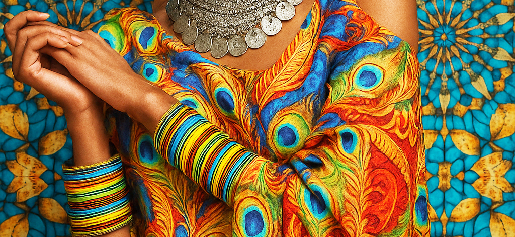
But the striking difference is the introduction of a stunning colourful kaleidoscopic pattern that makes the whole packaging more lively and expresses at a first glance the warmth and diversity of Mauritius. A graphic scheme that allows harmonious and artistic colour variations across the product range.
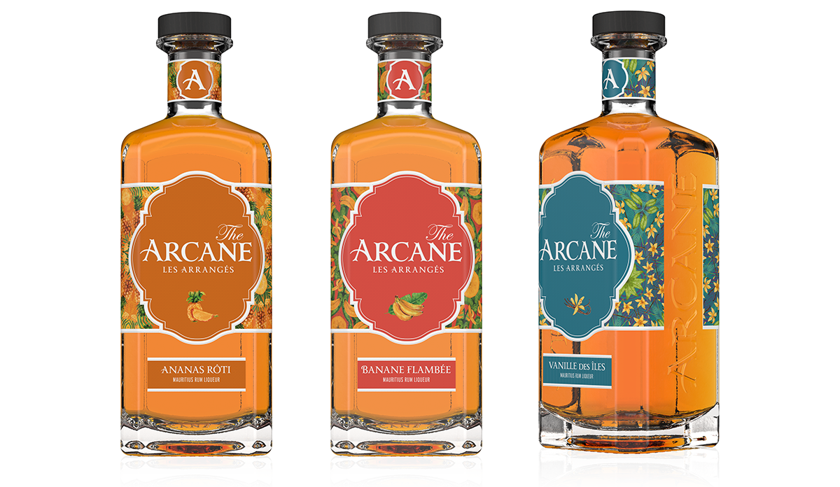
The range of flavoured rums is also evolving, with the introduction of a version in a clear glass bottle and labels in vibrant colours.
AREAS OF EXPERTISE
Brand identity
Label graphic design
Box & coffret design
Brand speech
Illustrations
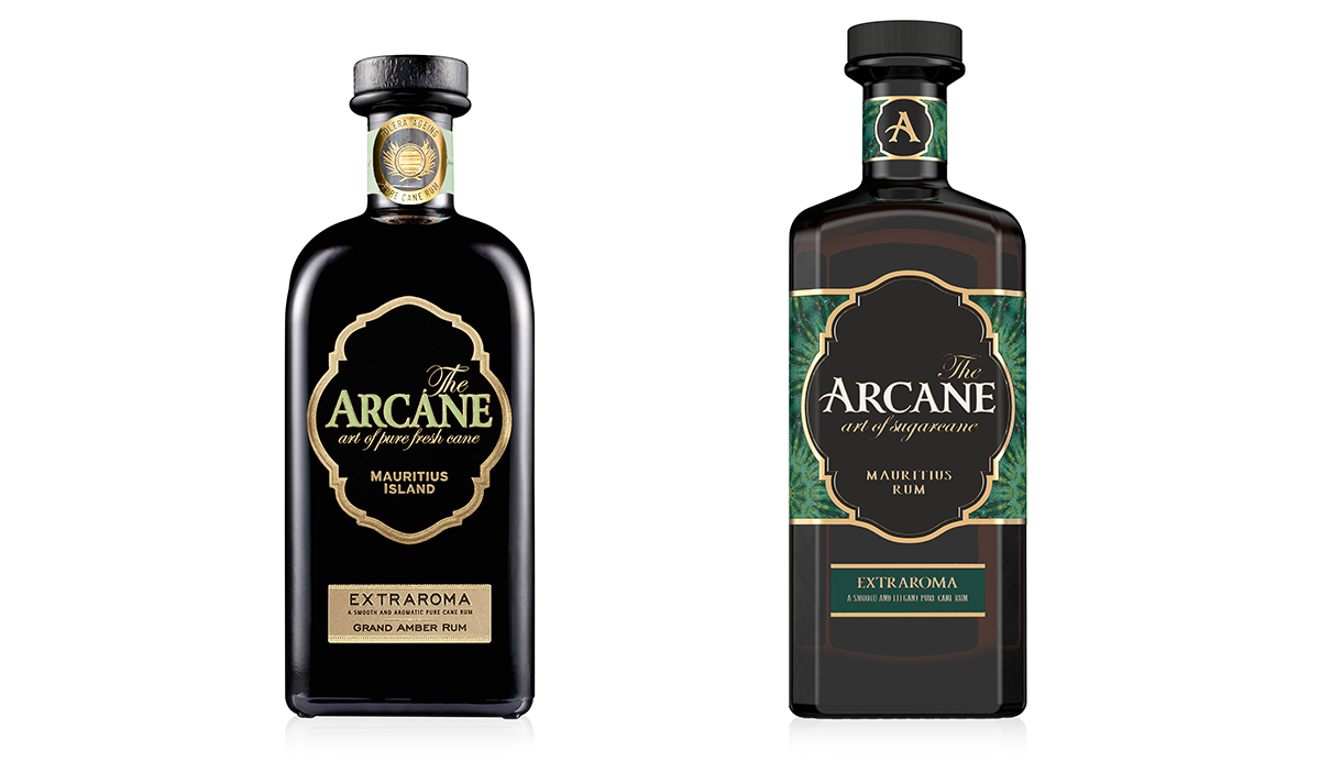
PREVIOUS / NEW

DETAILS
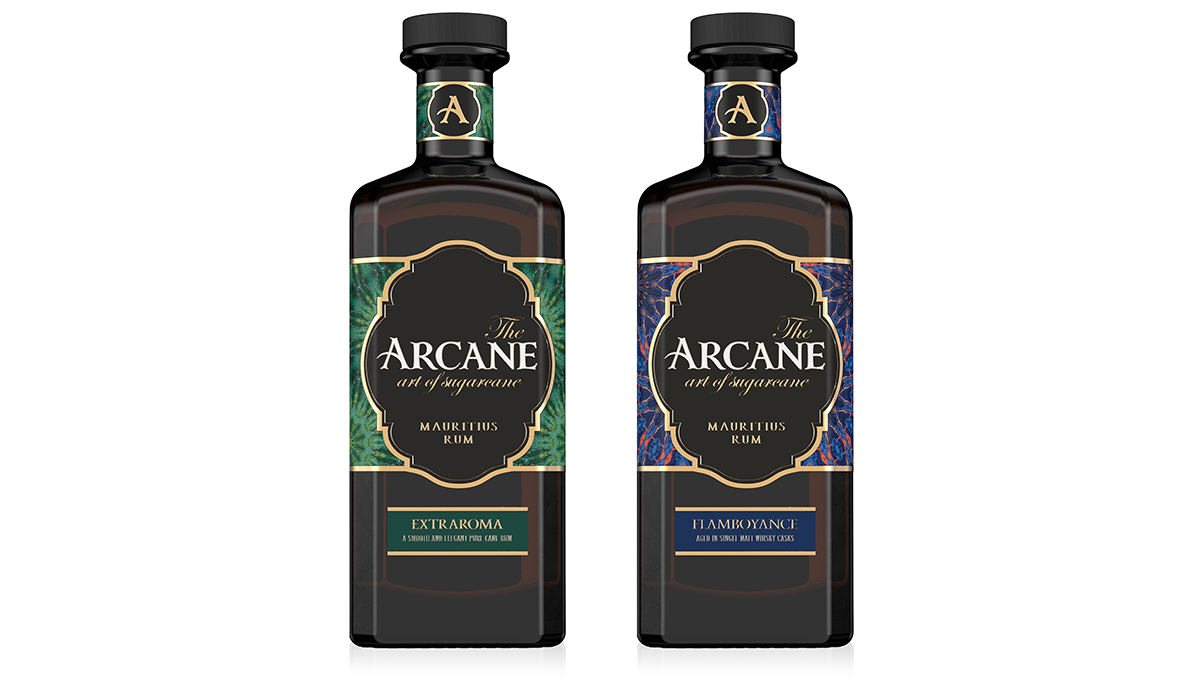
THE CLASSIC RANGE
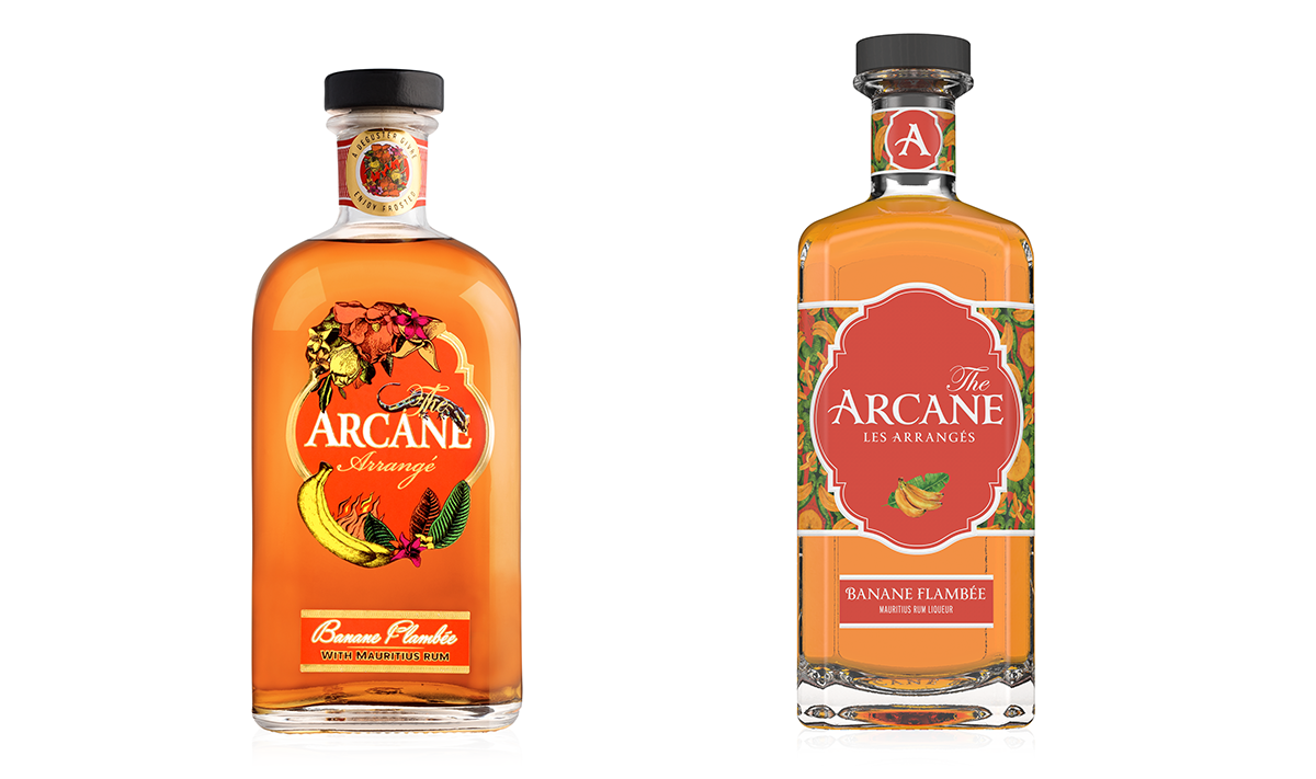
PREVIOUS / NEW
“LES ARRANGÉS” (FLAVOURED RUMS)
