GOSSET
A gentle revolution
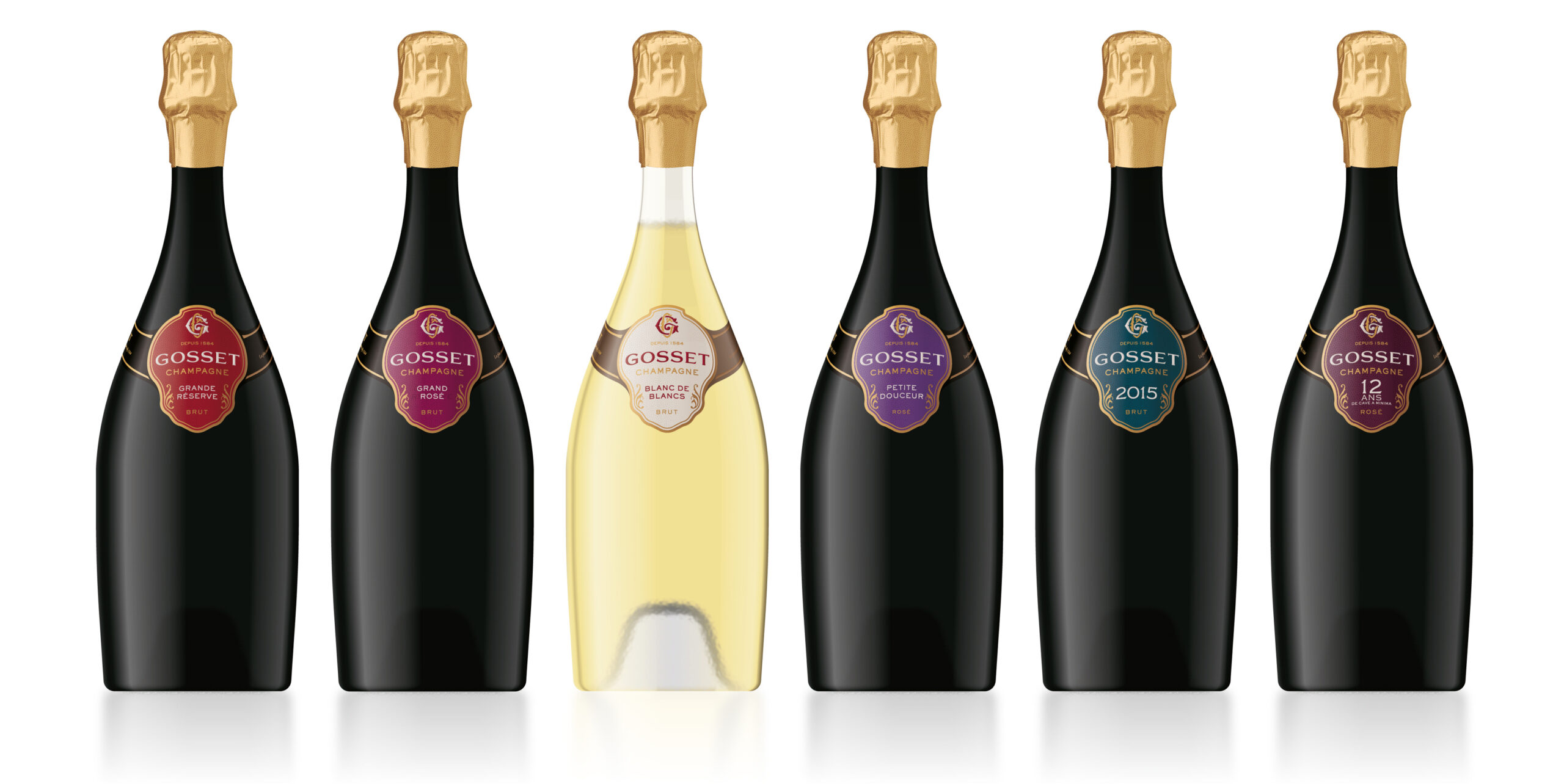
To evolve its packaging expression, Gosset – the oldest Wine House in Champagne (Aÿ, 1584) – entrusted Megusta with the task of developing the brand platform and redesigning its visual identity and packaging.
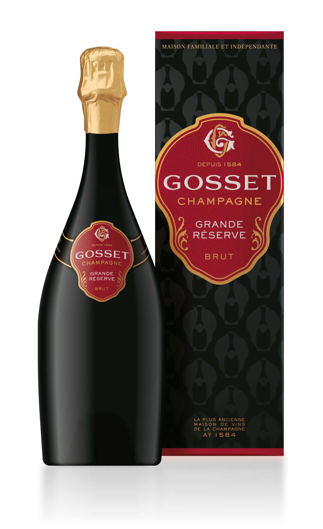
Chosen for its ability to challenge certain preconceptions of the brand team while capitalizing on its distinctive identity codes, the agency reinterpreted and enhanced the historical codes of the House to showcase the exclusive antique bottle that has remained intact since the 18th century.
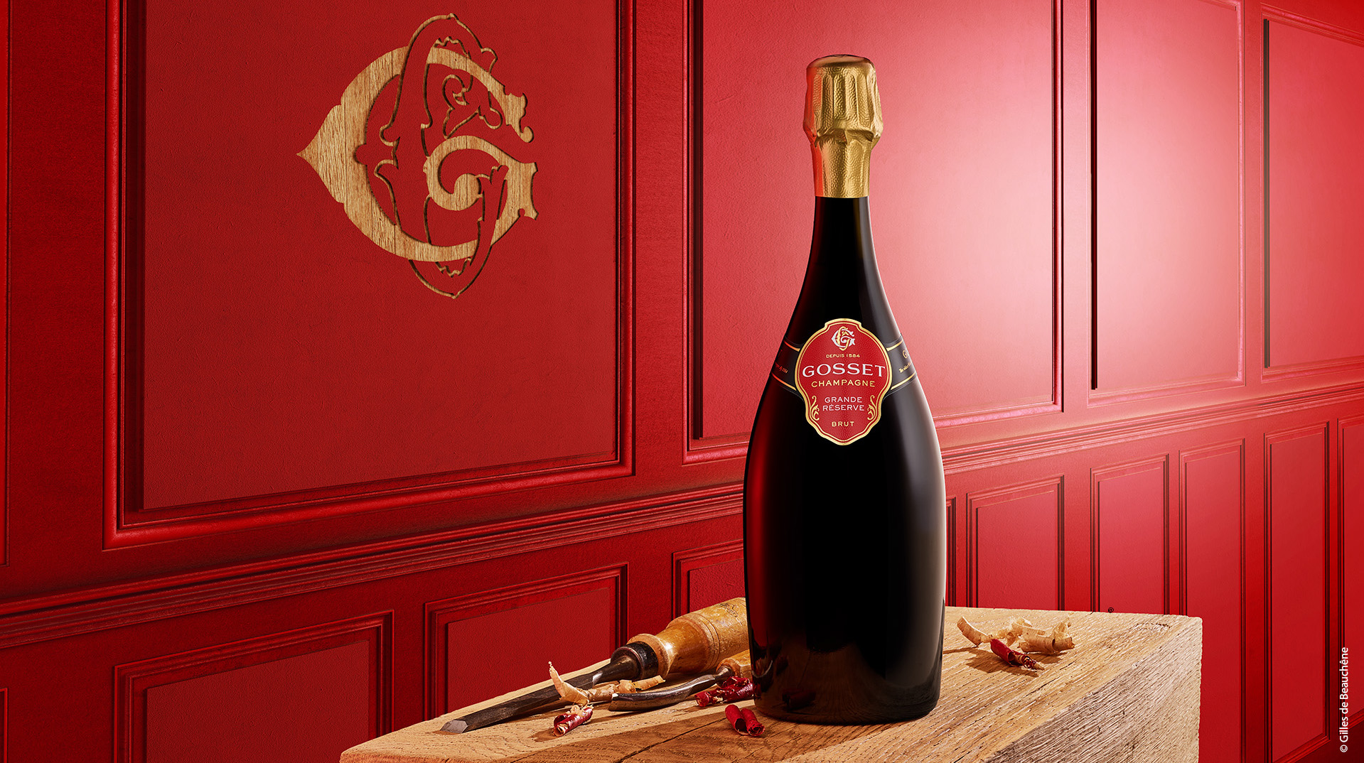
The brand identity evolves with a logo in hand-drawn letters that replaces the ordinary Copperplate font and is adorned with a carefully crafted monogram deeply rooted in the brand’s history.
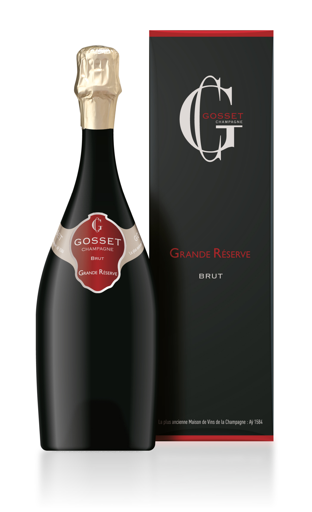
For its part, the label collar – called ‘sautoir medallion’ and emblem of Gosset since the 1760s – remains, instantly recognizable with its sleek line and rounded sides. Its legs are now black, allowing the medallion to assume its original shape in contrast with the bottle, without disrupting its curves. It is enriched with subtle ornaments and a personalized background pattern, which can be found on the capsule and packaging, as well as on communication materials.
A return to the essence to highlight a brand that is firmly rooted in its past while being open to the world today.
AERAS OF EXPERTISE
Brand platform
Brand book
Brand identity
Graphic guidelines
Label graphic design
Box & coffret design
Promotional packaging
Brand speech
Copywriting
Visual territory
Brochure

PREVIOUS

NEW
PREVIOUS
NEW
